Colour Lovers |
||
Layout Themes |
||
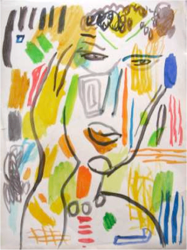 |
This image relates to my contour because the actual face is very simple. It looks similar to my contour drawing because the style of line and shape used is the same. I also like how most of the colored shapes have nothing to do with the actual face in this portrait. It adds an organized but chaotic emotion. |
|
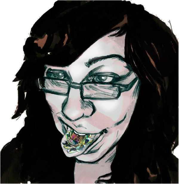 |
This portrait is interesting because it is simple and has a specific focal point. Everything on the face is simple but her tongue adds and interesting detail. The fact that it is on her tongue and in her mouth is symbolic like it’s something she is trying to say. I also like how her skin is metallic and luminescent while her hair, eyebrows, and contour lines of the face are matted and dull, adding contrast between the two. |
|
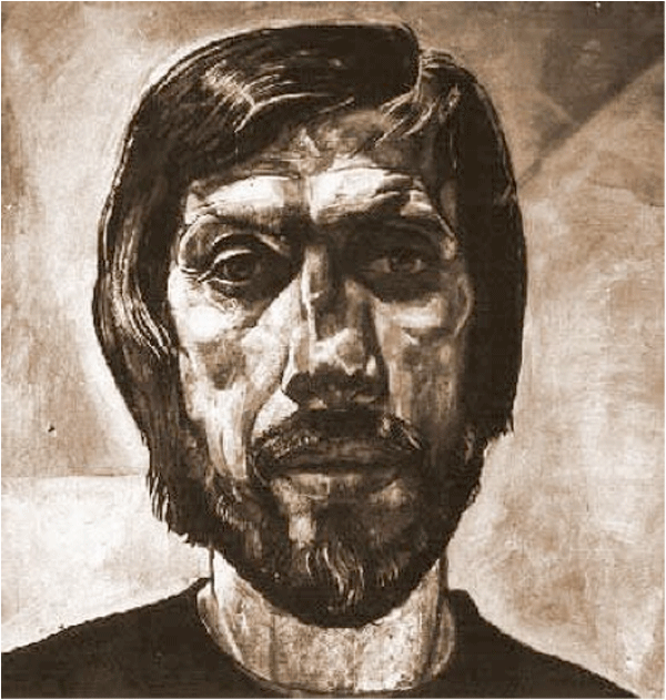 |
This is a self-portrait of Boris Kazakov called “A Captive of Eternity” made in 1970. I love this portrait because there is a mix of realistic and distorted facial parts. The hair and eyes are very realistic looking, while Kazakov’s nose looks flattened and distorted. I also like how much detail is added all over his face. This particular portrait inspires me to consider adding realistic and unrealistic parts to my portrait. |
|
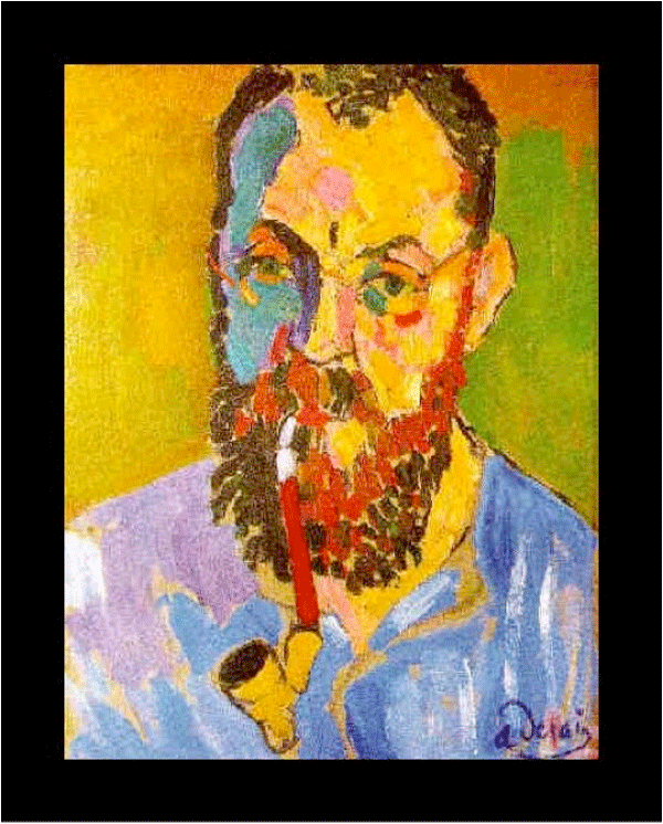 |
In this portrait I like how the face is separated by shapes of different color. Even in the background there are patches of color that add dimension. There are almost no contour lines, leaving only the shapes to add texture and detail. The colors are also very vibrant and loud. |
|
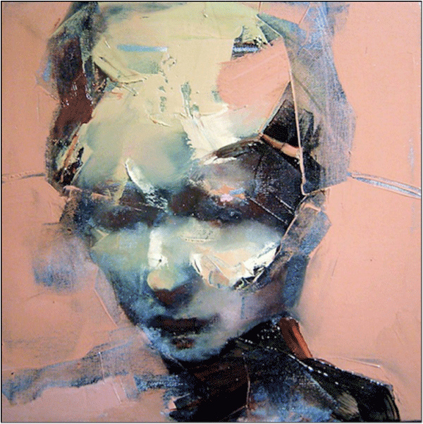 |
This portrait is along the lines of how I want my portrait to turn out. The actual face is visible but the patches and swatches of color add a very interesting effect. I love the simplicity of the face and solid background color contrasted with the chaos of shape and added material. The blue color in the face and the chaotic shapes on her head show a very strong emotion, sadness. |